As an expert in your field, it’s likely you come upon common questions from or shared experiences of the clients you serve. You’re deeply familiar with your work and how to serve your clients well, so not only do you provide a seamless process, but you’re also available to share your expertise, recommendations, and advice along the way.
At With Grace and Gold, we feel the same way about web design. Not only are we passionate about creating new brands and new web designs with purpose — but we’re also always available to share our expertise and recommendations regarding how to create a purpose-driven, connection-driven web design your clients will connect with, value, and remember.
As we approach our 8th year in business, we’ve been honored to see and review hundreds of web designs. That’s why, today, we’re sharing 10 of the most common website mistakes we see, and exactly how to fix them! That way, if you’d like, you can use today’s episode as a checklist — to ensure your website is polished and ready to serve your visitors well!

Top 10 Website Mistakes and How to Fix Them
Welcome to Episode 111 of the Brand It, Build It Podcast: Top 10 Website Mistakes and How to Fix Them!
Over the past 7 years, we’ve been honored to see and review hundreds of web designs for our prospective clients, current clients, or clients who have booked With Grace and Gold’s Web Design Audit service. These experiences have equipped us to observe common website mistakes — mistakes which could lead visitors to click away from your website and continue shopping around for the right business. Often times, there are small, yet impactful, ways your website can be enhanced, better serve your visitors, and better equip your visitors for success.
So, here are the top 10 mistakes we’ve observed:
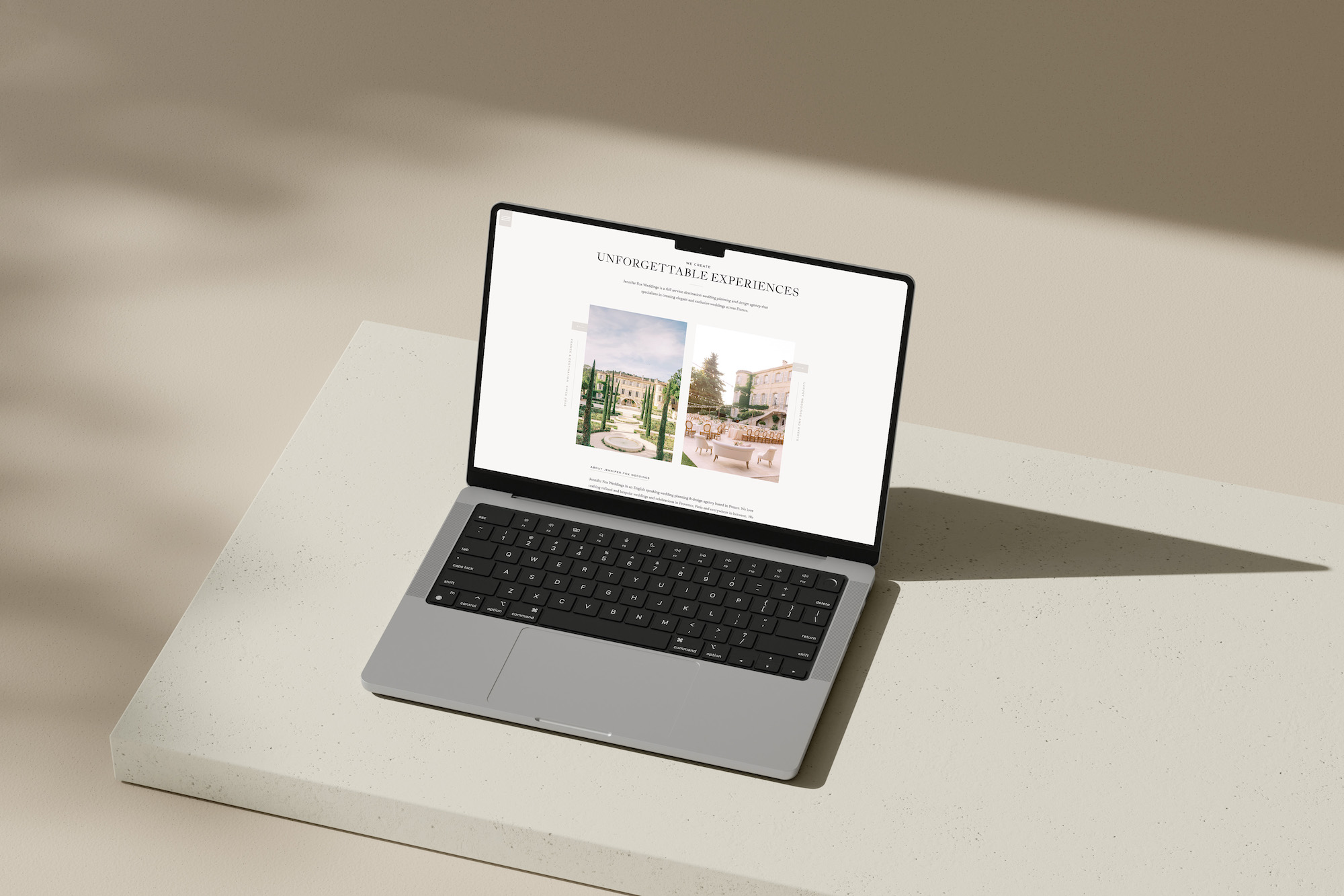
- An unclear navigation menu, or a website with too many pages. When we approach navigation menu design, we often think about how someone might be brand new to your business, and therefore, brand new to your website. In just 1, maximum 2, clicks, each visitor should be able to seamlessly reach the content or information they’re looking for. Consider whether pages with similar content can be condensed — included on one page rather than several pages. Consider whether some pages belong in your primary navigation menu, while others may belong in your secondary navigation menu, a hidden hamburger menu, or your footer menu. Often, you’d like your visitors to reach the revenue-generating areas of your business — making your services page, your shop page, and your contact page really valuable pages to showcase. As you review your navigation menu, think about the way brand new visitors may approach, understand, or use your navigation menu. Does your navigation menu help to equip your visitors for success and move your business forward?
- No elevator pitch above the fold. Your elevator pitch, or a summary of who you are, what you do, who you serve, and if your business is location-bound, where you serve, should appear on your Home page, visible even before visitors need to scroll down. The area of your website visible before visitors need to scroll down is called “above the fold.” When your elevator pitch appears above the fold, you equip your visitors to immediately learn the need-to-know details of your business and confirm they are in the right place — that your business offers a solution to the problem they are seeking help with.
- Broken links. As your business grows, it’s likely the pages of your website grow, too. Perhaps you began as a photographer, and now you offer education. Perhaps you began as a podcaster, and now you offer an in-person conference. As your business grows and changes, it’s likely the pages of your website do, too. If your website is smaller or more curated, you may consider reviewing each page and each link within your website manually. On the other hand, if your website is larger or more complex, you may consider using a broken link checking plugin on WordPress or a broken link checking website to have your website’s links reviewed using technology.
- Grammatical or spelling errors. We believe, from a visitors’ perspective, attention to detail within your website can be a demonstration of attention to detail overall. After all, your website can sometimes be the first point of contact or communication with your prospective clients. At first glance, a few online services are available to check your website’s spelling and grammar. Otherwise, it can be helpful to commit to carefully reviewing one page of your website each day, until your website has been reviewed in full.
- An unlinked logo. It’s likely your logo is present at the or near the top of your website. Be sure your logo is linked to your Home page. Many visitors intuitively use your logo design as a way to return to the Home page, so linking your logo can be a major help in creating a user-friendly experience for your visitors.
- Not having social media profiles open in a new window. It’s likely social media icons are part of your web design, with each social media icon linking to its respective social media profile. These links should open in a new window. That way, when visitors click to follow you on social media, your social media profile opens in a new window, and visitor can easily navigate back to your website, because it remains open in another tab. This web design best practice ensures your visitors are able to continue exploring your website — which is helpful not only for business purposes, but also for search engine optimization.
- On the other hand, another mistake we have seen is having website pages or blog posts open in a new window. Traditionally, only pages that live outside of your website or your domain name should open in a new window. If your website pages or blog posts open in a new window, your visitors’ experience could become complicated or even overwhelming. Therefore, we recommend reserving the ‘open in new window’ feature solely for websites that live outside of your website or domain name. Links to social media profiles, links to course platforms, or links to newsletter landing pages are just a few examples of pages that can open in a new window — because they live outside of your website and domain name.
- Too many font styles. We recommend a maximum of 4-5 font styles, and for those font styles to be used consistently in size and in formatting throughout your website. When your heading font style is used for all headings, and your paragraph font style is used for all paragraphs — in a cohesive color, font size, and format — you will discover your website has a cleaner appearance and a more elevated aesthetic. Traditionally, we recommend using script font styles sparingly. When it comes to script fonts…
- Another common mistake we see is kerning script fonts. Kerning refers to the spacing between the letters of a font style. Kerning tends to work well for all uppercase subheadings or headings and for serif or sans serif font styles. Script fonts, on the other hand, are designed to have a connected appearance, just like cursive handwriting would. Kerning script fonts makes the script fonts more challenging to read. So, if a script font style is used within your Showit web design, for example, we recommend setting the kerning — or Letter Spacing as it is referred to within Showit — to 0.
- Not including a menu or call-to-action in your footer. As mentioned at the start of today’s list, having a menu within your footer design — or the very last section on each page of your website — can be a really helpful way to equip visitors to continue exploring your website. This is especially helpful if your primary navigation menu isn’t fixed, or doesn’t stick to the top of the page when a visitor scrolls. A navigation menu in your footer, or a call-to-action at or near the bottom of each page is a really helpful way to equip your visitors for successfully continuing to explore your website — or for successfully pursuing your services or purchasing your products.
How many of these tips resonated with you, or which of these can you apply to your website? If you found today’s episode helpful, please share it on Instagram stories and tag @withgraceandgold. We’d love to connect with you and re-share your story, too! Thanks for tuning in!
About Brand It, Build It Podcast, Hosted by Kelly Zugay
Hosted by Kelly Zugay, co-founder of With Grace and Gold, The Brand It, Build It Podcast is a leading small business marketing podcast for small business owners, creatives, founders and entrepreneurs. Enjoy weekly, actionable episodes to build a successful, sustainable small business from the inside out.
Elevate your business with purpose using With Grace and Gold's step-by-step guide to raising your prices confidently. Receive the Guide
Free Guide to Raising Your Prices
Free Guide
Confidently
Become familiar with Showit using an expertly-created, completely-customizable Showit template by With Grace and Gold. Download
Free Showit Template by
Free Showit Template
With Grace and Gold
Does your brand communicate luxury? Take our assessment and create a luxury brand for your business. Receive the Guide
How to Create a Luxury Brand
Free Guide
for Your Business