Welcome to Brand It, Build It—a podcast by With Grace and Gold, where we share practical, approachable brand and web design strategies for small business owners. I’m your host, Kelly Zugay, and today, we’re talking about something that often gets overlooked in web design but has the power to transform how your website works for your business: white space.
Now, I know what you might be thinking—white space? That empty space on a website? Shouldn’t I be using all of my space to showcase my business? But the truth is, white space is one of the most powerful tools in web design. When used well, it makes your website feel high-end, professional, and easy to navigate. And more importantly—it can actually increase conversions, meaning more inquiries and sales for your business.
So, let’s dive into why white space matters, how it influences your audience, and how you can start using it to your advantage today!
What is White Space?
First things first—what exactly is white space?
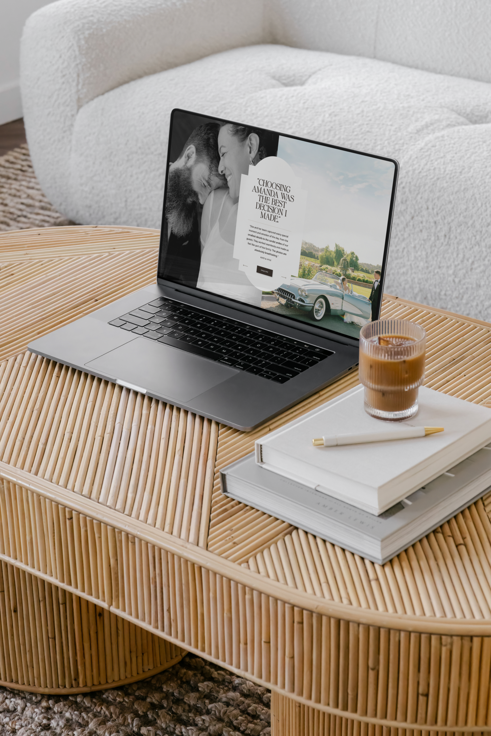
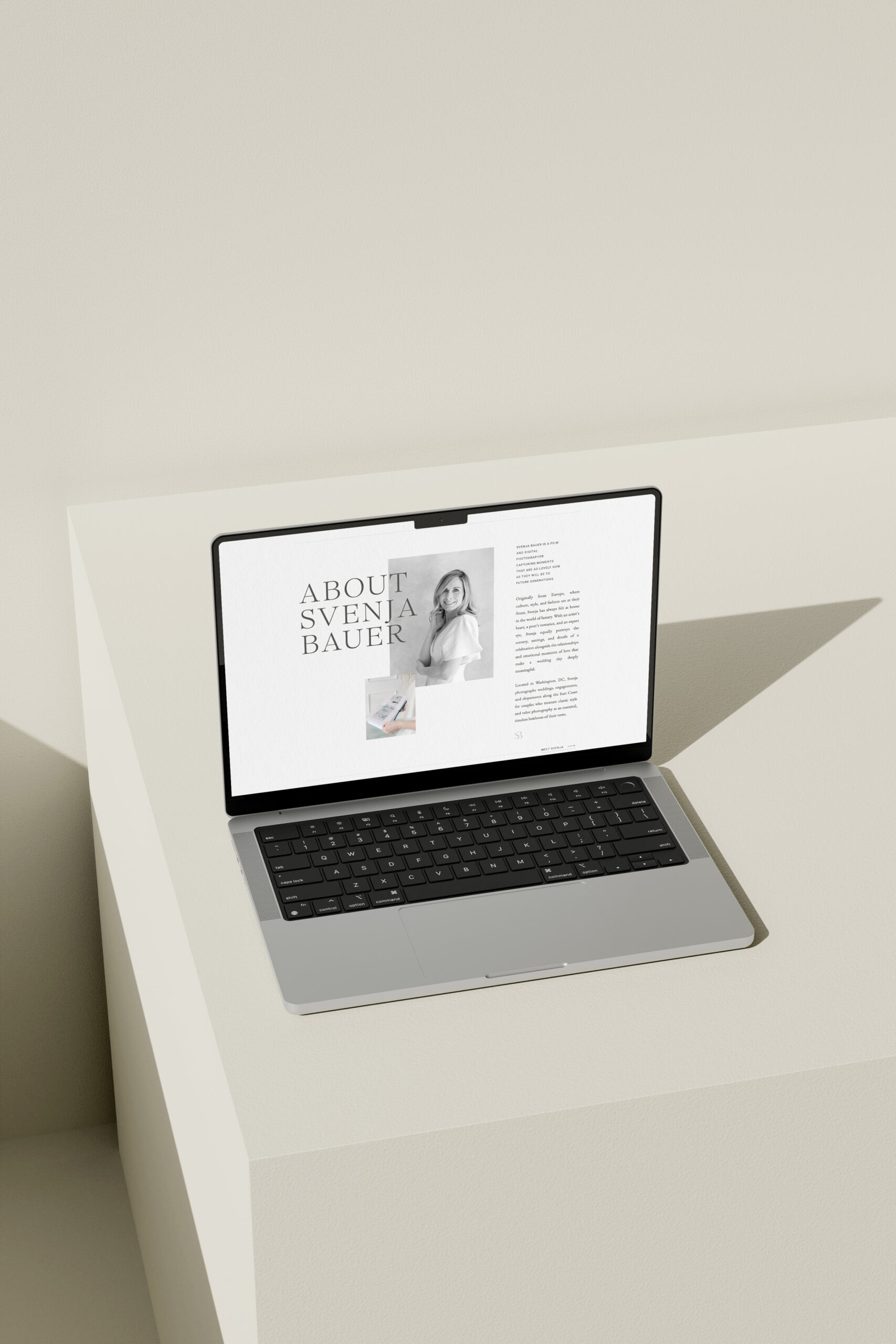
White space, also known as negative space, is the empty space between elements on a webpage—like text, images, and buttons. It doesn’t necessarily have to be white; it can be any background color. But the key is that it’s open space without clutter.
Think about a luxury boutique. When you walk in, everything is displayed beautifully, with space to move around and focus on each item. Now, compare that to a crowded discount store with shelves packed to the brim. The boutique feels intentional, high-end, and easy to shop in—whereas the discount store feels overwhelming.
That’s exactly what white space does for your website—it gives your content room to breathe, making everything feel more polished, inviting, and high-end.
Why White Space Matters in Web Design
So, why should you embrace white space in your web design? Here are three key reasons:
It Makes Your Website Easier to Read and Navigate
Have you ever landed on a website with walls of text, tons of images, and no breathing room? It can feel overwhelming, right?
Studies show that websites with good use of white space are easier to read and navigate. When your content is spaced out intentionally, visitors can quickly find the information they need—without feeling like they’re searching for a needle in a haystack.
And when it’s easy to find information, visitors are way more likely to take action—whether that’s booking a service, making a purchase, or signing up for your newsletter.
It Creates a More Luxury, High-End Feel
One of the biggest differences between a high-end website and a DIY-looking website? Space.
Luxury brands like Apple and Chanel use white space strategically. They keep their websites clean, with minimal text and big, beautiful images. This simplicity makes their brands feel elevated and expensive.
The same applies to your business! If your website feels clean, open, and well-organized, potential clients will perceive your brand as polished, professional, and worth investing in.
It Increases Conversions
At the end of the day, your website isn’t just about looking good—it’s about working for your business.
Research shows that when websites use white space effectively, conversion rates increase. Why? Because a clutter-free layout helps people focus on what actually matters—your call to action.
If you want visitors to book a service or purchase a product, white space draws their attention exactly where you want it. Without unnecessary distractions, they’re more likely to take action.
How to Use White Space on Your Website
Now that we know why white space is so powerful, let’s talk about how you can start using it on your website today:
Simplify Your Homepage
Your homepage should feel like a breath of fresh air—not an information overload. Try reducing the number of elements on your homepage, focusing only on the must-have content.
Ask yourself:
- Does every section serve a purpose?
- Can I remove anything without losing clarity?
Sometimes, less is more—especially when it comes to making a strong first impression.
Space Out Your Text and Images
Give your text some breathing room! Instead of long, overwhelming paragraphs, break up your content into shorter sections with plenty of space in between.
Try using:
- Bullet points (like this!)
- Headings to break up text
- Shorter paragraphs with space between them
This makes your content much easier to skim—because let’s be honest, most people don’t read word-for-word. They scan. And well-spaced content makes scanning effortless.
Be Intentional with Calls-to-Action
Your call-to-action (or CTA) is the most important part of your website. It’s the button or link that leads visitors to book a call, purchase a product, or sign up for your list.
To make your CTA stand out:
- Surround it with white space so it’s easy to see.
- Keep the design simple—don’t clutter it with too much text.
- Use a bold, contrasting color to draw attention.
When your call-to-action is clear and uncluttered, visitors won’t have to guess what to do next—they’ll just do it.
Final Thoughts
At the end of the day, white space isn’t just about making your website look good—it’s about making it work better. By embracing white space, you create a website that’s easy to navigate, visually appealing, and designed to convert visitors into paying clients.
So, take a look at your website today—are there areas where you can simplify? Where can you add more breathing room? A few small changes can make a huge difference.
Thank you for tuning into today’s episode of Brand It, Build It! If you found this episode helpful, I’d love for you to subscribe, leave a review, or share it with a fellow business owner. And as always, if you need a beautifully-designed, conversion-driven website, visit us at With Grace and Gold. Until next time—keep building your brand with purpose and confidence!
Brand It, Build It Podcast, Hosted by Kelly Zugay
Hosted by Kelly Zugay, co-founder of With Grace and Gold, The Brand It, Build It Podcast is the best small business marketing podcast for small business owners, creatives, and founders. Weekly, brief, actionable episodes will equip you to build a successful, sustainable small business. Since 2014, With Grace and Gold has provided award-winning custom brand and Showit web design and completely customizable Showit website templates for small businesses worldwide.
Trusted by industry leaders worldwide, our customizable Showit templates are designed to create connection and results. Shop Now
Showit Website Templates
Done-for-you templates

A one-of-a-kind brand and website — thoughtfully crafted to reflect your goals and the experience only you can offer. Learn More
Custom Design Services
Custom Brand and Web Design

The must-have resource for Showit designers. Design more efficiently with our library of canvases and resources. Learn More
The Showit Design Library
Showit Canvases for designers