Welcome to Brand It, Build It Podcast — a podcast designed to equip you with the tools and strategies you need to grow your business with purpose and confidence through branding, web design, and marketing. I’m your host, Kelly Zugay — and today, we’re diving into a powerful concept that could change how you think about your website forever:
The 5-Second Rule.
And no, not the one about dropping food on the floor — but the one that applies to your website visitors — and whether they stay, or leave. Let’s get started.
What Is the 5-Second Rule for Websites?
When a visitor lands on your website, you have about five seconds to do three very important things:
- Tell them who you are,
- Tell them what you do, and
- Tell them what to do next.
That’s it. Five seconds.
According to a study from the Missouri University of Science and Technology, users form an opinion about your website in as little as 2.6 seconds — and in just a few seconds more, they decide whether to stay or leave. So while we call it the “5-Second Rule,” it’s really even faster than that.
Why First Impressions on Your Website Matter
Research from Stanford University found that 75% of users admit to making judgments about a company’s credibility based on their website design alone. In other words, how your website looks — and how easily it communicates — plays a huge role in whether visitors trust you enough to stay, explore, and eventually become clients. Even if your services are exceptional — if your Home page is cluttered, confusing, or unclear — you’re unintentionally losing potential clients before they even have the chance to connect with you.
Common Mistakes That Break the 5-Second Rule
Here are a few ways websites often miss the mark:
- An unclear headline:
If the first thing your visitor sees doesn’t immediately explain what you offer or who you serve, you’re losing valuable attention. - Busy, overwhelming design:
A report by Adobe found that 38% of people will stop engaging with a website if the content or layout is unattractive. Too many colors, fonts, pop-ups, or moving parts can create overwhelm. - No clear next step:
If a visitor has to work to figure out where to go — whether it’s learning about your services, booking a consultation, or browsing your work — chances are, they won’t.
How to Pass the 5-Second Test
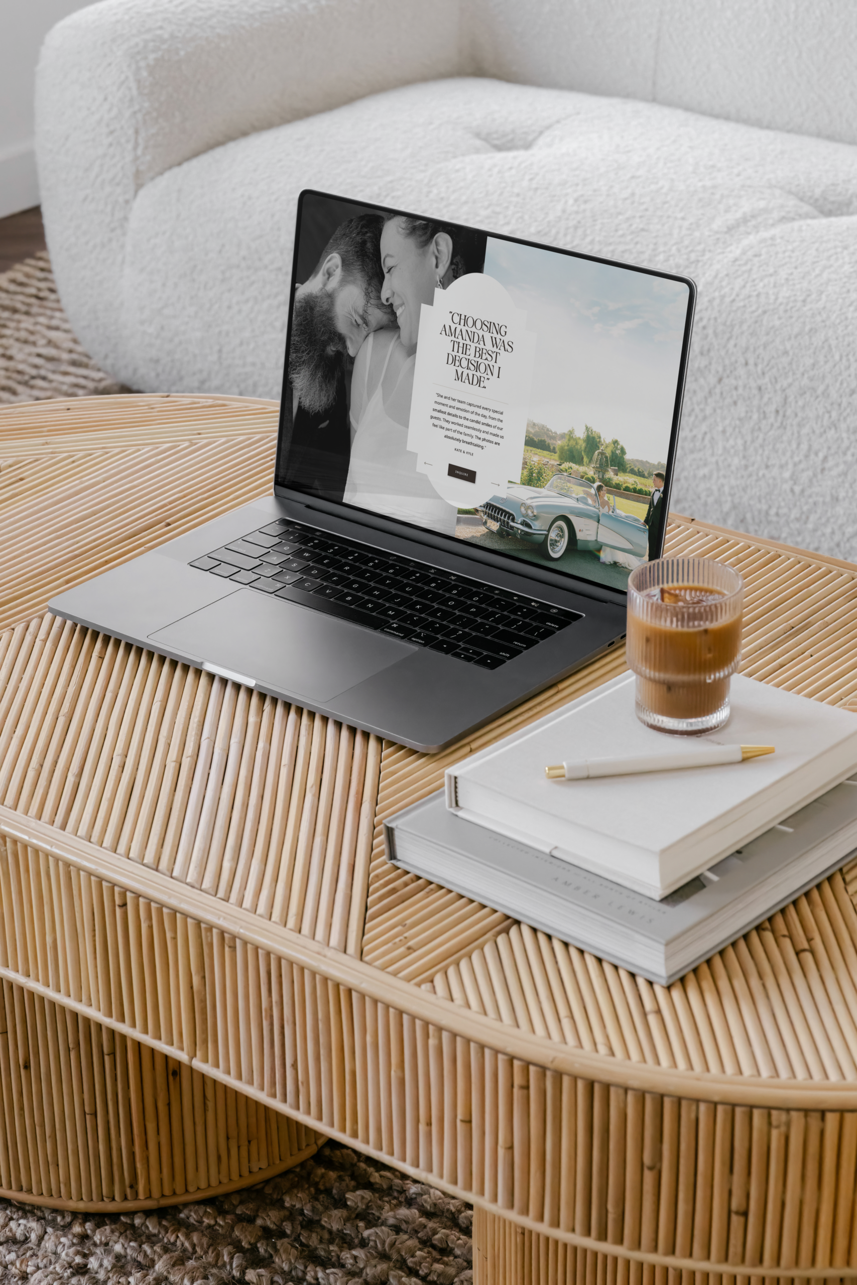
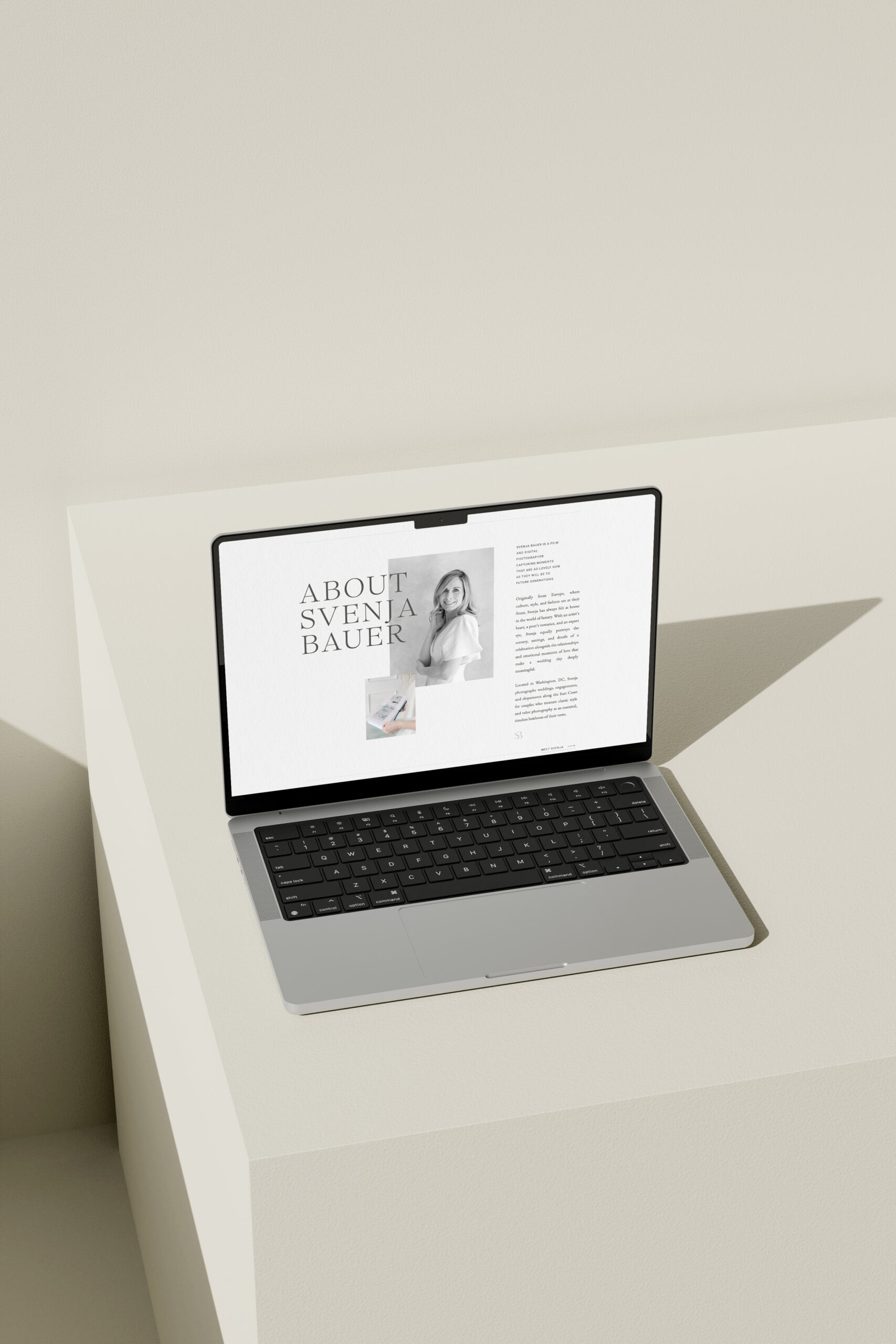
When we design brands and websites at With Grace and Gold, we always approach the Home page with the 5-second rule in mind. Here’s how you can apply it too:
- Craft a Clear and Confident Headline
Right at the top of your Home page, clearly state who you are, what you do, and who you serve. No cleverness required — just clarity. - Use Strategic Visual Hierarchy
Research shows that users naturally scan websites in an “F-pattern” — focusing heavily on the top and left-hand side of the page. Design your site so that key information — like headlines and calls-to-action — appears exactly where their eyes naturally go first. - Offer an Immediate Call-to-Action
Invite visitors to take a clear, confident next step: “Book a Call,” “Browse Services,” “Get Started.” Simplicity wins. - Simplify, Then Simplify Again
Remember: every extra option or visual element adds cognitive load. Studies show that when users feel overwhelmed, they disengage — so editing your Home page is just as important as building it.
How to Test Your Own Website’s First Impression
If you want to see how your website holds up, here’s a simple exercise:
- Open your Home page and glance at it for just 5 seconds.
- Then, look away and ask yourself:
- Who was this for?
- What were they offering?
- What action was I supposed to take?
If the answers aren’t immediately clear, that’s a strong signal your Home page could be simplified and strengthened.
The Takeaway
Your website doesn’t need every trending feature.
It doesn’t need flashy animations or endless scrolling sections.
It just needs to communicate clearly and confidently — fast.
When you apply the 5-second rule, you’re honoring your audience’s time, building trust, and guiding them toward becoming a client.
If you want to ensure your website connects with your audience from the very first second, we’d love to help. Explore our customizable Showit website templates — or learn more about our Custom Brand and Web Design Experience — at withgraceandgold.com.
Brand It, Build It Podcast, Hosted by Kelly Zugay
Hosted by Kelly Zugay, co-founder of With Grace and Gold, The Brand It, Build It Podcast is the best small business marketing podcast for small business owners, creatives, and founders. Weekly, brief, actionable episodes will equip you to build a successful, sustainable small business. Since 2014, With Grace and Gold has provided award-winning custom brand and Showit web design and completely customizable Showit website templates for small businesses worldwide.
Trusted by industry leaders worldwide, our customizable Showit templates are designed to create connection and results. Shop Now
Showit Website Templates
Done-for-you templates

A one-of-a-kind brand and website — thoughtfully crafted to reflect your goals and the experience only you can offer. Learn More
Custom Design Services
Custom Brand and Web Design

The must-have resource for Showit designers. Design more efficiently with our library of canvases and resources. Learn More
The Showit Design Library
Showit Canvases for designers