If your website looks good but still doesn’t feel like it’s working, you’re not alone.
This is one of the most common things we hear from business owners — especially those who’ve been in business for a while. The website is live, the branding feels polished, and traffic might even be coming in… but something feels off.
In most cases, the problem isn’t your website itself.
It’s what your website is missing.
And it’s almost never more content, more sections, or more explaining.
Your Website Isn’t Broken — It’s Just Misaligned
The internet loves to tell business owners that their website needs fixing. New copy. New layouts. Better SEO. More calls to action.
But after years of designing brands and websites, we’ve learned that most websites aren’t broken — they’re just out of alignment.
Your business evolves.
Your expertise deepens.
Your audience changes.
But your website often stays frozen in an earlier season of your business.
That’s when frustration sets in.
Your website may still look beautiful, but it no longer reflects who you are, who you serve, or how you actually help people today.
Most Websites Try to Explain — Not Guide
One of the biggest things business owners miss is this:
Your website isn’t meant to show everything you can do.
It’s meant to guide someone toward a decision.
When someone lands on your website, they don’t have context yet. They don’t know your background, your journey, or how much experience you bring to the table.
They’re quietly asking themselves a few simple questions:
- Is this for me?
- Do they understand what I need?
- Can I trust them?
If your website makes them work too hard to find those answers, they’ll leave — even if your work is excellent.
Clarity always outperforms complexity.
Why “Saying More” Usually Hurts Conversions
When something isn’t converting, the instinct is to add more.
More explanations.
More sections.
More detail.
But clarity doesn’t come from saying more — it comes from saying the right thing in the right order.
Strong websites create a clear path. They help visitors understand:
- Who you help
- What problem you solve
- Why it matters
- What to do next
Not eventually — but quickly.
When websites feel overwhelming, it’s usually because they’re trying to speak to everyone at once, instead of intentionally guiding one person forward.
Your Website Should Meet Your Audience Where They Are
Another common issue? Designing a website for yourself instead of your audience.
You know your story.
You know your offers.
You know your process.
Your audience doesn’t — yet.
A high-converting website meets visitors where they are in their journey, not where you are in yours. It anticipates their questions, their hesitations, and their needs, and answers them calmly and confidently.
That’s when trust is built.
And trust is what leads to action.
Flow Matters More Than Aesthetics Alone
Beautiful design matters — but flow matters more.
What does someone see first?
What do they understand next?
What emotion do they feel before being asked to take action?
Conversion doesn’t come from pressure or flashy tactics. It comes from confidence.
When someone feels understood, supported, and guided, taking the next step feels natural — not forced.
If Your Website Feels “Almost Right,” That’s Good News
If you’ve ever looked at your website and thought, This is close, but not quite there, that’s actually a great sign.
It usually means:
- Your business has matured
- Your positioning has refined
- You’re ready for a stronger foundation
The solution is rarely a full overhaul just for the sake of change. Often, it’s about refinement — simplifying your message, tightening your positioning, and designing with intention.
A Simple Question to Ask Yourself
Here’s a helpful place to start:
If someone landed on my website for the very first time today and skimmed the page, would they immediately understand what I do, who it’s for, and why it matters?
If the answer is “almost,” alignment is closer than you think.
When your website starts working with you instead of asking more from you, business feels lighter, clearer, and more sustainable. And that’s exactly what a great website is meant to do.
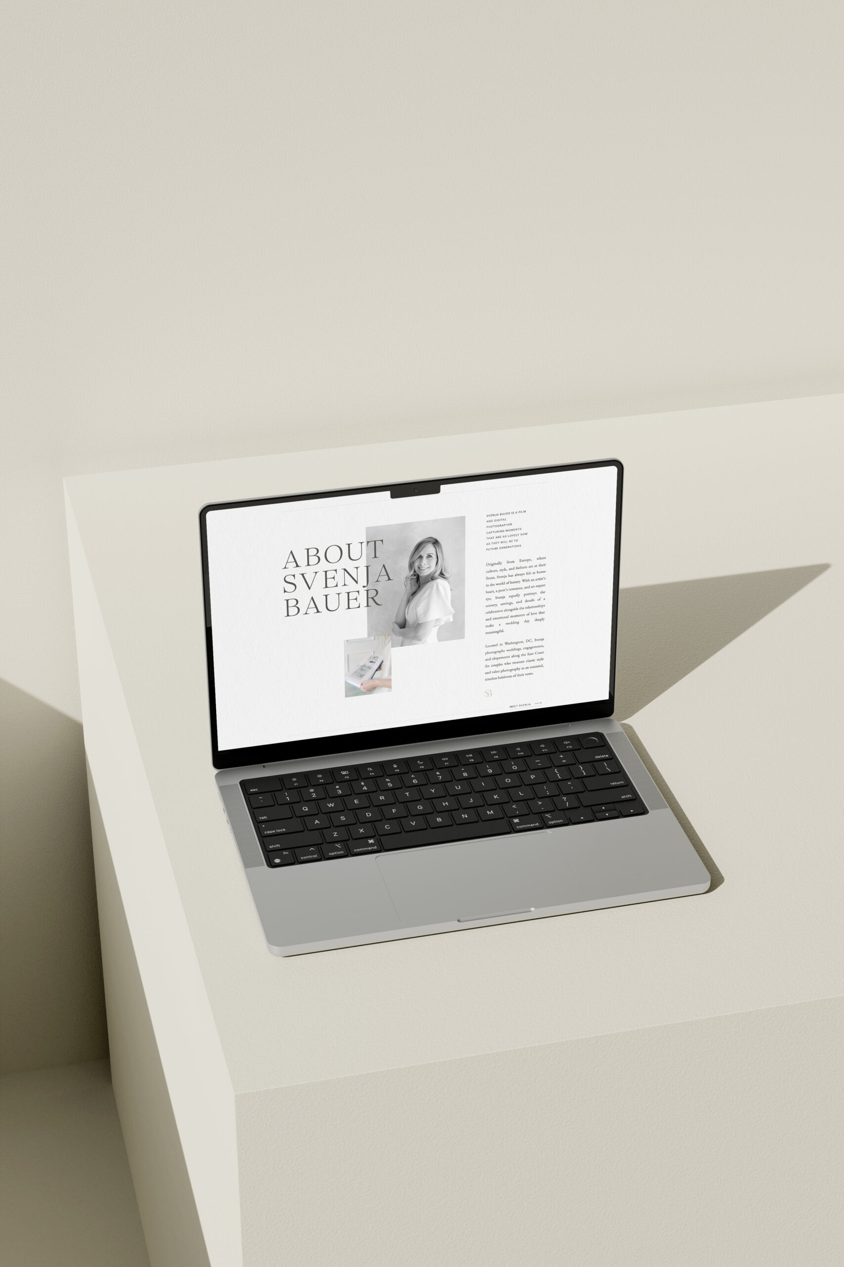
Trusted by industry leaders worldwide, our customizable Showit templates are designed to create connection and results. Shop Now
Showit Website Templates
Done-for-you templates

A one-of-a-kind brand and website — thoughtfully crafted to reflect your goals and the experience only you can offer. Learn More
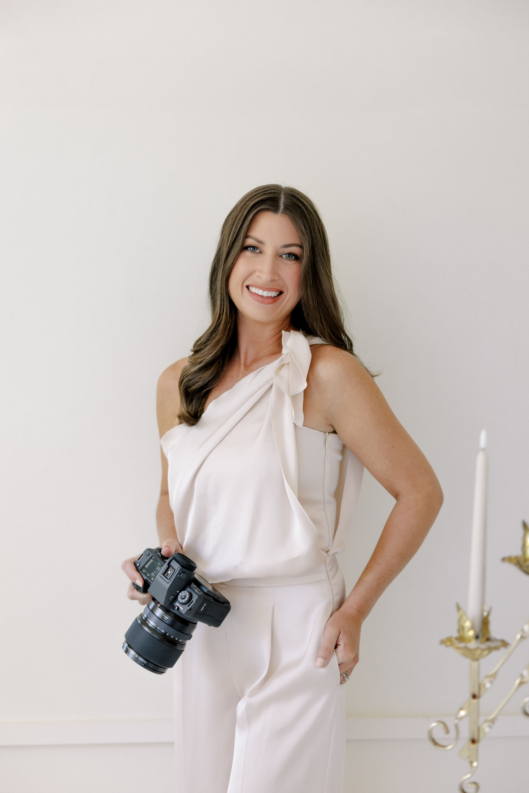
Custom Design Services
Custom Brand and Web Design

The must-have resource for Showit designers. Design more efficiently with our library of canvases and resources. Learn More
The Showit Design Library
Showit Canvases for designers